
Introduction
The product
EduGirl is a charity that promotes girls' right to education.
The product is a website flow that helps busy professionals who love charity work to conveniently donate online to the charity at their own time.
Project duration
June 2023 to July 2023
The problem
Busy professionals don’t have time to donate in person & need a convenient way to donate online.
My role
UX Designer designing the donation flow for EduGirl charity website from conception to delivery a Google UX Design course project.
My duties
Conducting interviews, paper and digital wireframing, low and high-fidelity prototyping, conducting usability studies, accounting for accessibility, and iterating on designs.
Tools and Methods
Figma, User personas, User stories, User journey maps, Affinity diagrams, Site map, User interviews, Competitive audit, Usability tests.
UX Design Process
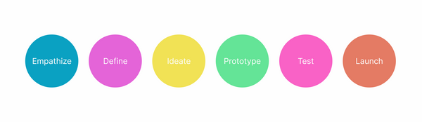
I used these steps to complete this design project:
1. Empathize
• Understand the user.
• Conduct user interviews.
• Create user personas, user stories, user journey maps.
• Conduct competitive audit.
2. Define
• Create the problem statement.
3. Ideate
• Come up with ideas for design solutions - Crazy eights, Paper wireframes, Digital wireframes.
4. Prototype
• Create lo-fi prototype or hi-fi prototype, depending on the maturity of the product.
• For the hi-fi prototype, I create the mockups first.
5. Test
• Test lo-fi prototype or hi-fi prototype.
• Record user feedback & observations from usability tests.
• Create affinity diagram.
• Extract insights form usability test.
• Refine designs.
6. Launch
• Launch the product - This stage was skipped because this was a design project done as part of the Google UX Design course.
User research
Research methods used
I conducted user interviews and created user personas, user stories & user journey maps to understand the users I was designing for and their needs. I also conducted a competitive audit.
Learnings from research
User research
The user groups identified through research were:
-
Busy professionals who love charity work and need a convenient way to donate online.
-
Lovers of charity work who have vision problems who need to donate online through charity websites that have assistive technologies for visual impairments.
I conducted user interviews, which I then turned into empathy maps and user personas to better understand the target users and their needs. I discovered that the major user group identified was busy professionals who love charity work and need a convenient way to donate online, as most charity websites they had interacted with didn’t have a way to donate on the internet.
The other major user group identified was lovers of charity work who have vision problems. I discovered that charity websites don’t have assistive technologies for people who have visual impairments.
Persona 1: Diana
Problem statement
Diana is a busy professional who needs to conveniently donate online
because she wants to support her favourite charities on her own schedule.

Persona 2: Keith
Problem statement
Keith is a lover of charity work with vision problems who needs to donate through charity sites with assistive technologies for visual impairments because he needs to avoid eye strain.

Competitive audit
I conducted a competitive audit to identify opportunities & gaps to guide my design. The audit revealed that most charity donation sites had had long, overly detailed one-page donation forms, Limited payment options & no assistive technologies for visual impairments

Research Influence on design
I decided to first design a donation flow to provide busy professionals who love charity work with a way to donate online at their own time. I also added assistive technologies for lovers of charity work with vision problems.
I designed a easy-to-follow, breathable UI for the online donation form with a progress bar to give users constant feedback. In addition, I added multiple payment options to give users more freedom with choosing a donation method that was easiest for them.
Define the problem
From the research above, I was able to clearly define the problem statements for this project. I broke them down according to user groups using the user personas.
-
Diana is a busy professional who needs to conveniently donate online because she wants to support her favourite charities on her own schedule.
-
Keith is a lover of charity work with vision problems who needs to donate through charity sites with assistive technologies for visual impairments because he needs to avoid eye strain.
Ideation
I started with ideating for the desktop website first. I then ideated for the mobile & tablet designs to make a responsive website. This allows users to donate any place & any time.
Sitemap
I did a quick ideation exercise using Crazy Eights.

Crazy eights
I did a quick ideation exercise using Crazy Eights.

Wireframes
I then created paper wireframes to advance the design ideas from the Crazy Eights.


Paper wireframes - Desktop website

Paper wireframes - Mobile & Tablet websites
I then transformed the paper wireframes into digital wireframes. I began with the desktop website, then proceeded to create the mobile & tablet versions.


Digital wireframes - Desktop website

Digital wireframe - Mobile website
Digital wireframe - Tablet website
Mockups
I created mockups for the donation flow to guide the design of the high fidelity prototypes. I started with the desktop site, then proceeded with the mobile & tablet versions.


Mockups - Desktop Website Main Userflow


Mockups - Mobile & Tablet Websites
Test & Iteration
Usability tests details
-
I conducted a moderated usability tests for the lo-fi & hi-fi prototypes.
-
The location was in Nairobi & in-person.
-
There were 5 participants.
-
The length of each session was about 20 - 30 minutes.
Usability Tests
.jpg)

Findings Lo-Fi Usability Test
-
Users saw no need for the options for making recurring donations & prefer to donate at their own frequency.
-
Users saw no need to have the screen reader at the top navigation bar & the under settings menu.
-
Users prefer to have a separate contact page instead of contacts only at the footer.
-
Users found the donation flow easy to navigate.
-
Users found the provision for diverse payment methods useful.
Findings Hi-Fi Usability Test
-
Users need the “Donate” button to be enlarged & easier to see.
-
Users found the logo too light to see.
-
Users found the footer color too dark to read the information contained there.
-
Users found the donation flow easy to navigate.
-
Users found the feedback of the reactive buttons useful.
Iterations Based on Usability Tests
-
I removed the option for recurring donations as users expressed that this option made them feel pressured to donate more than they are able to.
Before usability tests
.jpg)
After usability tests

-
I removed the screen reader icon from the top navigation bar & put it only under the settings menu to eliminate confusion, following users’ feedback.
Before usability tests
After usability tests


-
I created a distinct contact page with a complete contact form based on user feedback. Users shared that they prefer a separate contact page instead of contact details only in the footer.
Before usability tests

After usability tests

-
On my own initiative, I added a predictive text feature. This helps busy professionals who love charity work, one of the major user groups, complete the donation form faster. This enhances the user experience of the donation flow.

-
I chose purple as the brand color because of its symbolic meaning tied to women’s rights. Purple was the chosen color for the women's suffrage movement in the early 1900s where American women protested for their right to vote in elections. The purple color was used to represent freedom and dignity. Similarly, I used the color purple in the designs to symbolize the right to education as a contributor to the freedom of girls & women.


Learnings
Impact
EduGirl donation flow provides an easy-to-use online option for users to make donations at their own convenience. The users shared that the donation flow was extremely easy to navigate. They also shared that the reactive buttons were useful by letting them know that their actions worked.
What I learned
-
I learned that users need constant feedback when taking actions in the userflow e.g. progress bar, reactive buttons.
-
I completed free video tutorials to learn how to create reactive buttons, interactive input fields & dropdown menus in Adobe XD, common useful features in websites.
Next steps
-
Conduct followup usability testing on the new website.
-
Identify any additional areas of need & ideate on new features.
Let’s connect!
Thank you for taking the time to review my work on EduGirl Website Donation Flow!
If you’d like to see more or get in touch, my contact information is provided below.
Email: lindaaotieno@gmail.com